A ground-up rebuild of bankwest.com.au, reorganised around what customers are actually trying to do.
Context
A 9-month design & build project for Bankwest.

Bankwest is one of Australia’s largest retail banks. Its website is where customers compare products, work out what things cost, and decide what’s right for them.
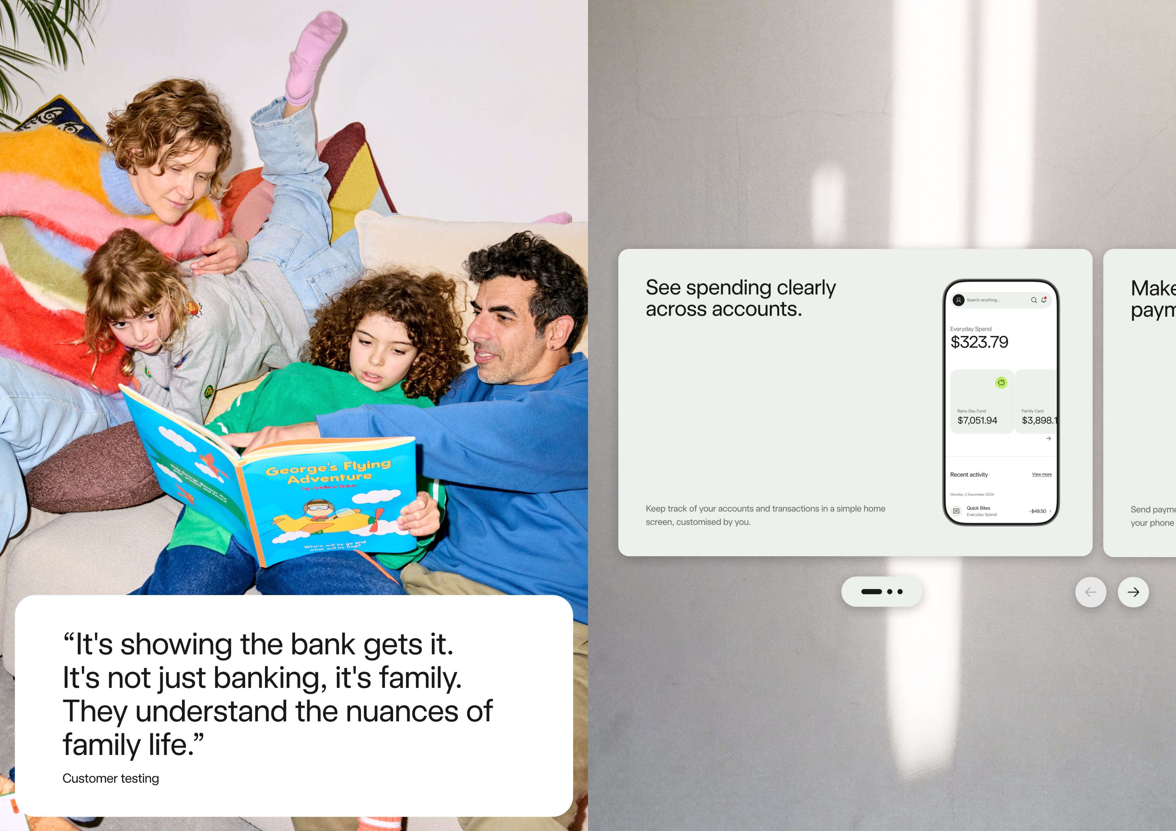
Banking has long left customers feeling overwhelmed, struggling to compare products, understand fees, and assess what suits their situation.
Challenge
How do you help people make confident decisions about money, when the products are inherently complex?
Spending, saving and borrowing money shouldn’t be so complex, but simplifying can’t mean hiding. Customers need to genuinely understand what they’re choosing, and they need to trust the numbers they’re shown.
Approach
Discovery
We started with Bankwest’s own strategy documents, looking for where the biggest opportunities sat — but also to answer a question that hadn’t been settled: who were they actually competing with?
Positioning as a challenger to the big four is a different product to positioning against Revolut or Monzo. The site couldn’t be designed until that was clear. Alongside it, we defined the audience, which set the terms for everything that followed.
Opportunity exploration
Four areas came out of discovery, each a distinct problem:
- Comparing products — the core decision customers arrive to make
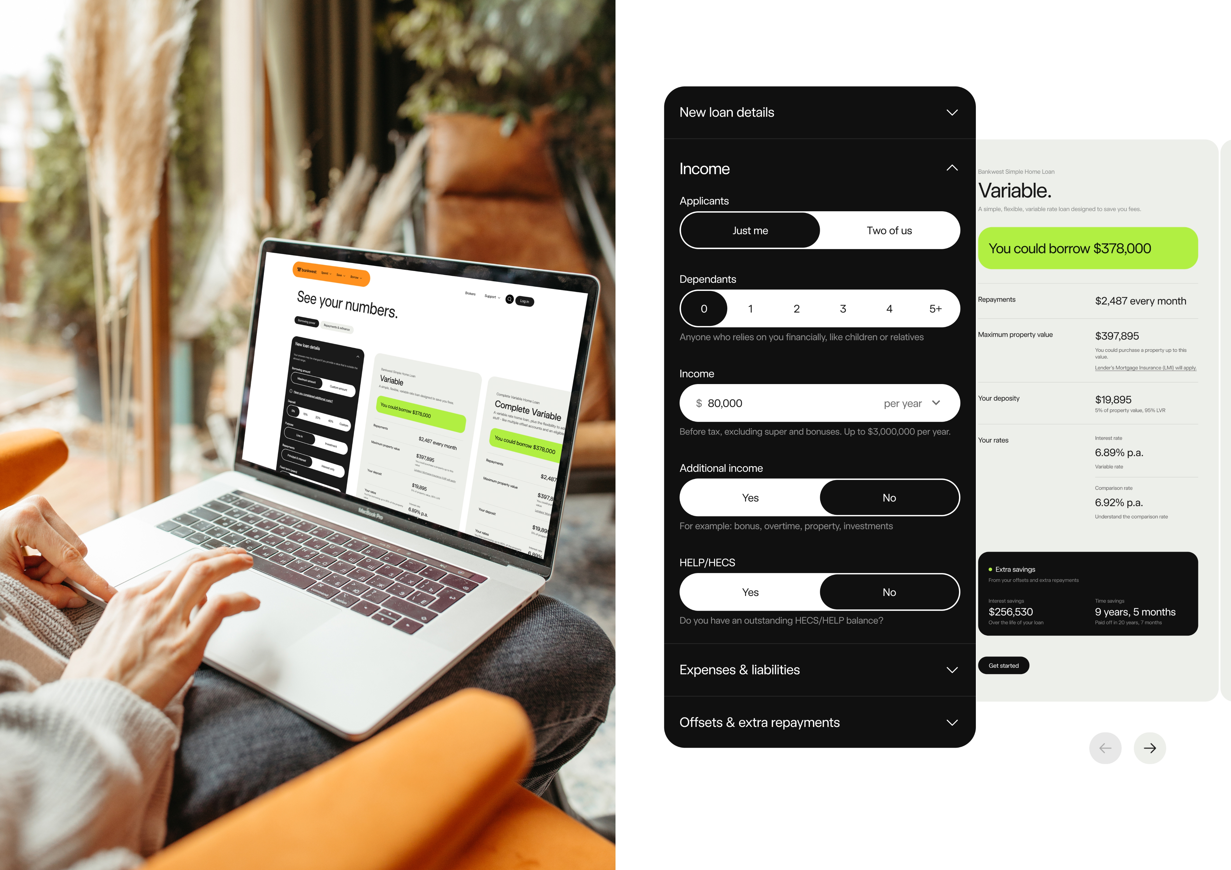
- Home loan calculators — the highest-stakes numbers on the site
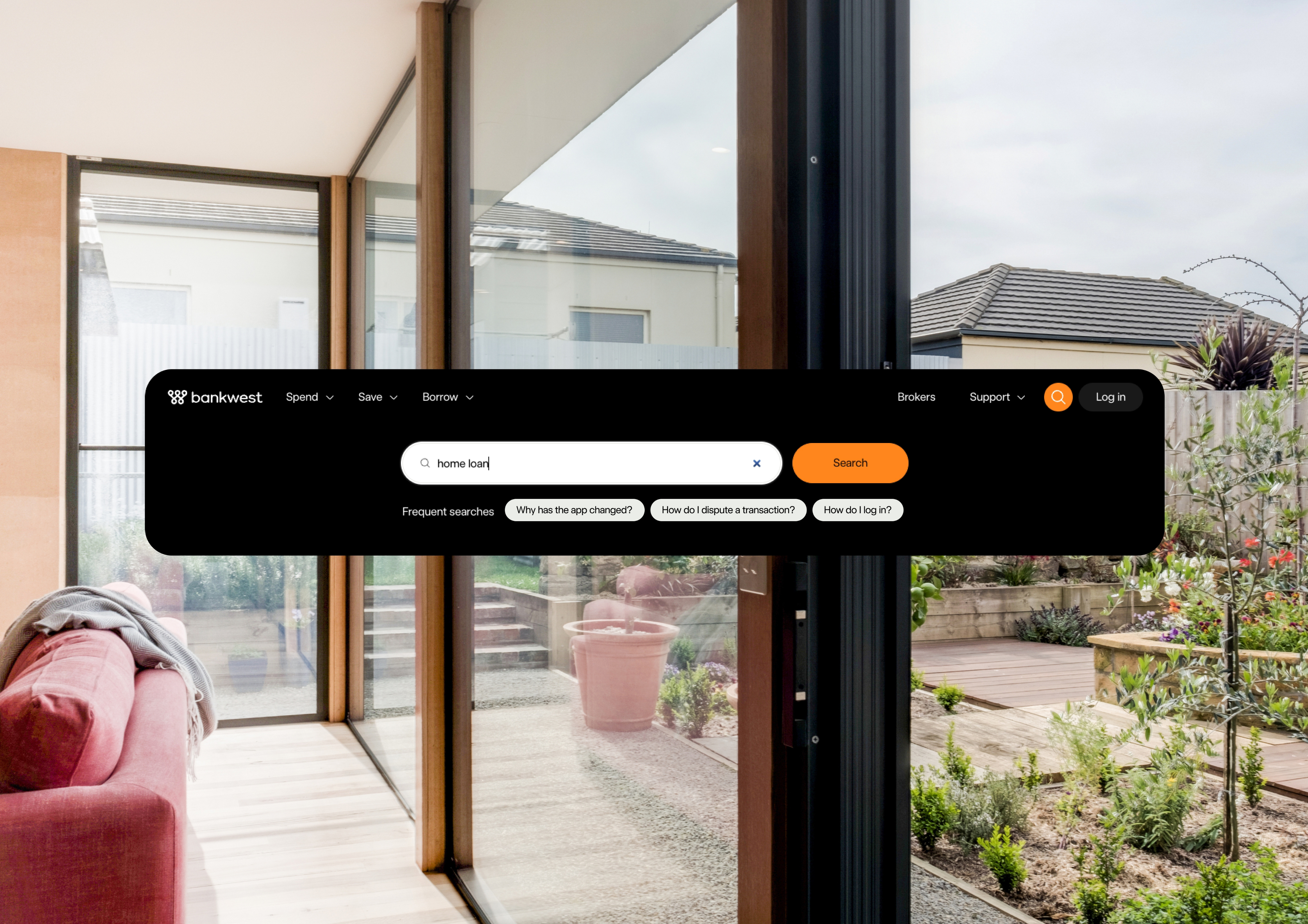
- Support — where customers go when the rest hasn’t worked
- High-level navigation — how people find any of it
Each ran through the same loop: market scan, prototype, test, insight, then fold the learnings back into the prototype. Rather than designing four features and validating at the end, each area got several passes before anything was committed.
Brand design
Bankwest had a brand document but had never executed it digitally. This phase translated it into a working component set — turning a brand book into something that could actually be built with.
Detailed design
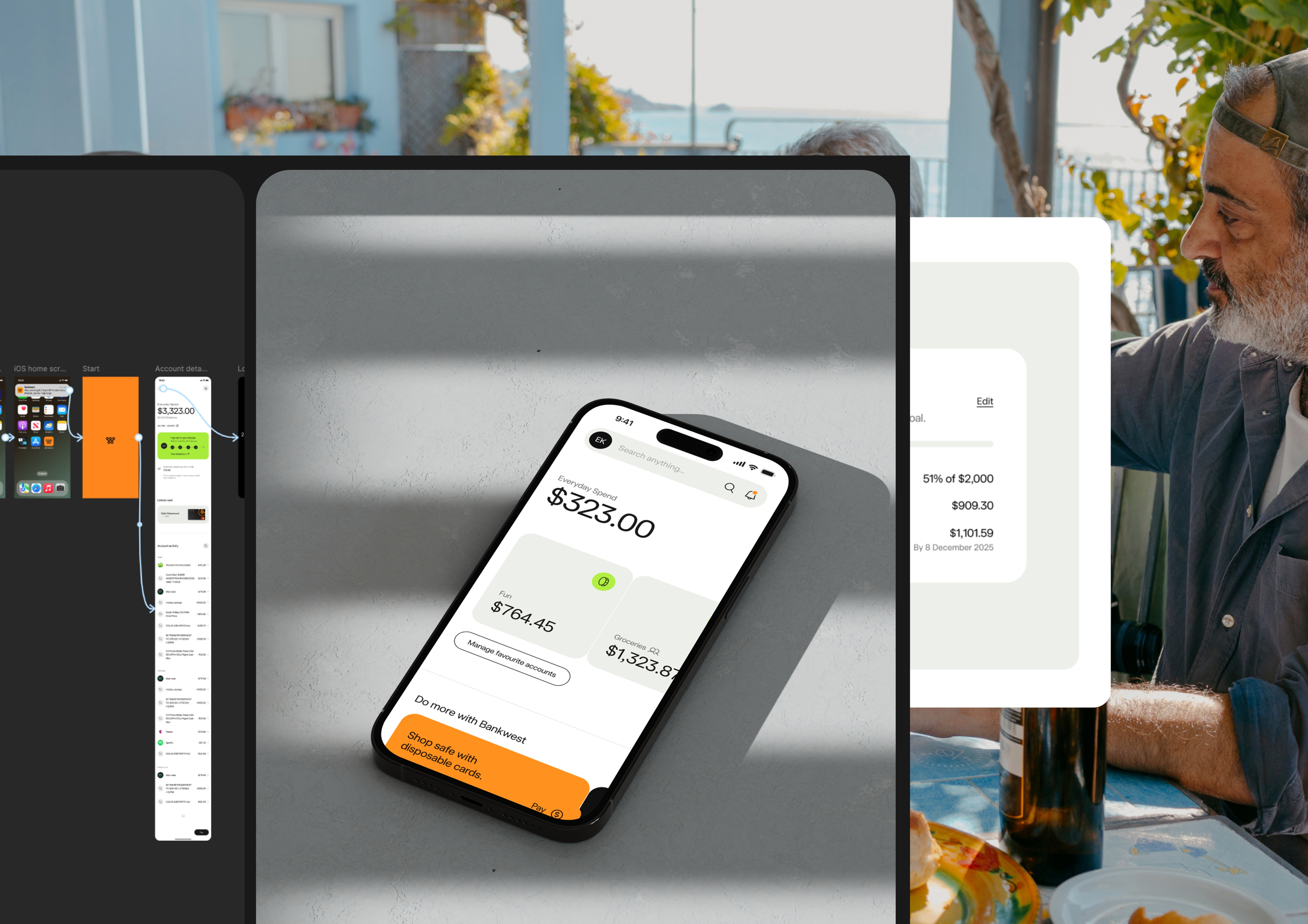
The four opportunities had been explored separately. This phase stitched them into a single end-to-end experience, then went deep: information architecture, the full component set, and documentation developers could build from.
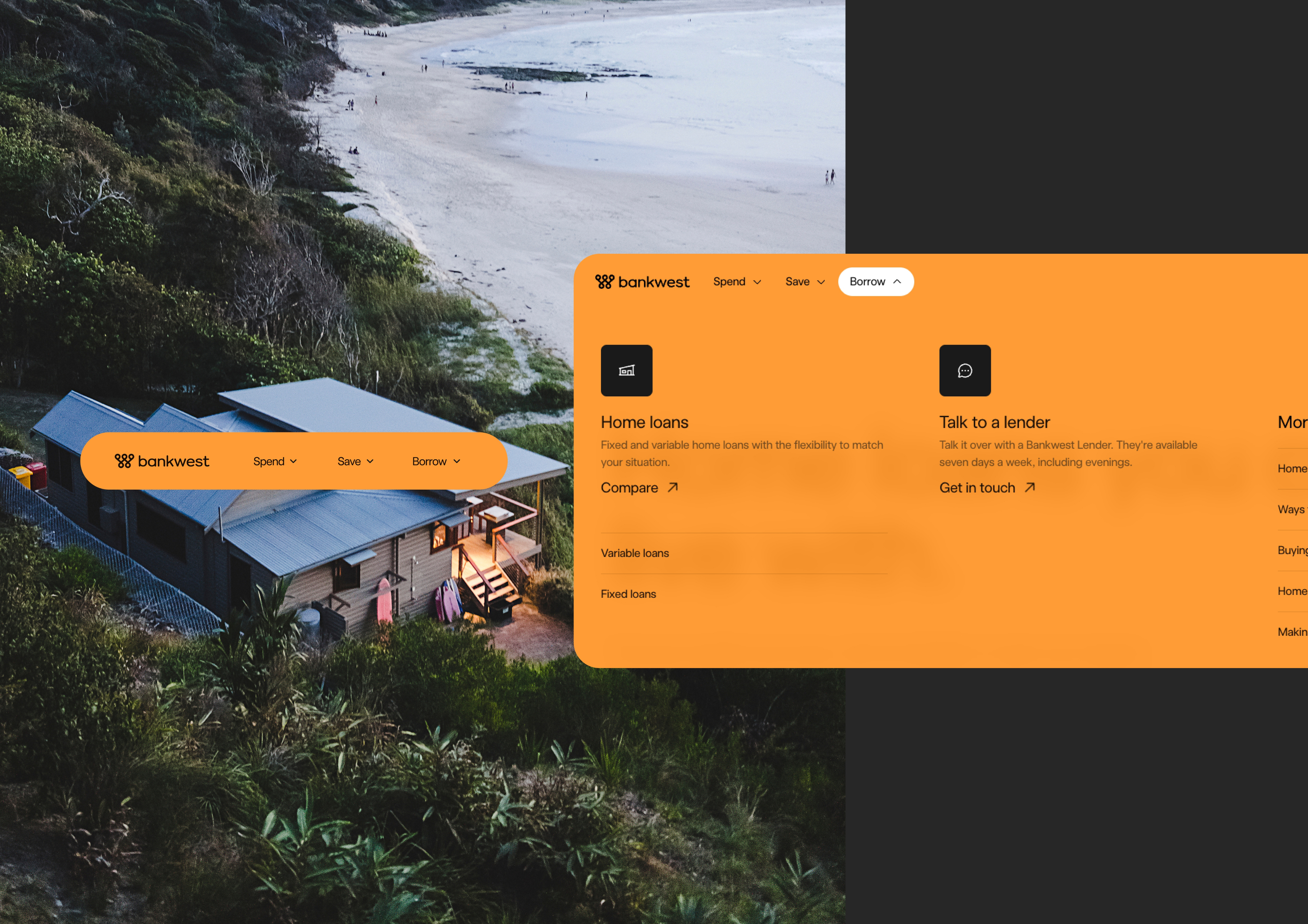
The site was reorganised around four core customer needs — Spend, Save, Borrow, Support — replacing a product-led structure with one that matched how customers arrive. Interactive comparison tools let customers weigh products side by side. Personalised calculators surfaced the numbers that actually mattered to them. Navigation, search and contextual help reduced friction at every step.
From there it was working directly with the development team through build, QA’ing against the designs, and resolving what came up.
Outcome
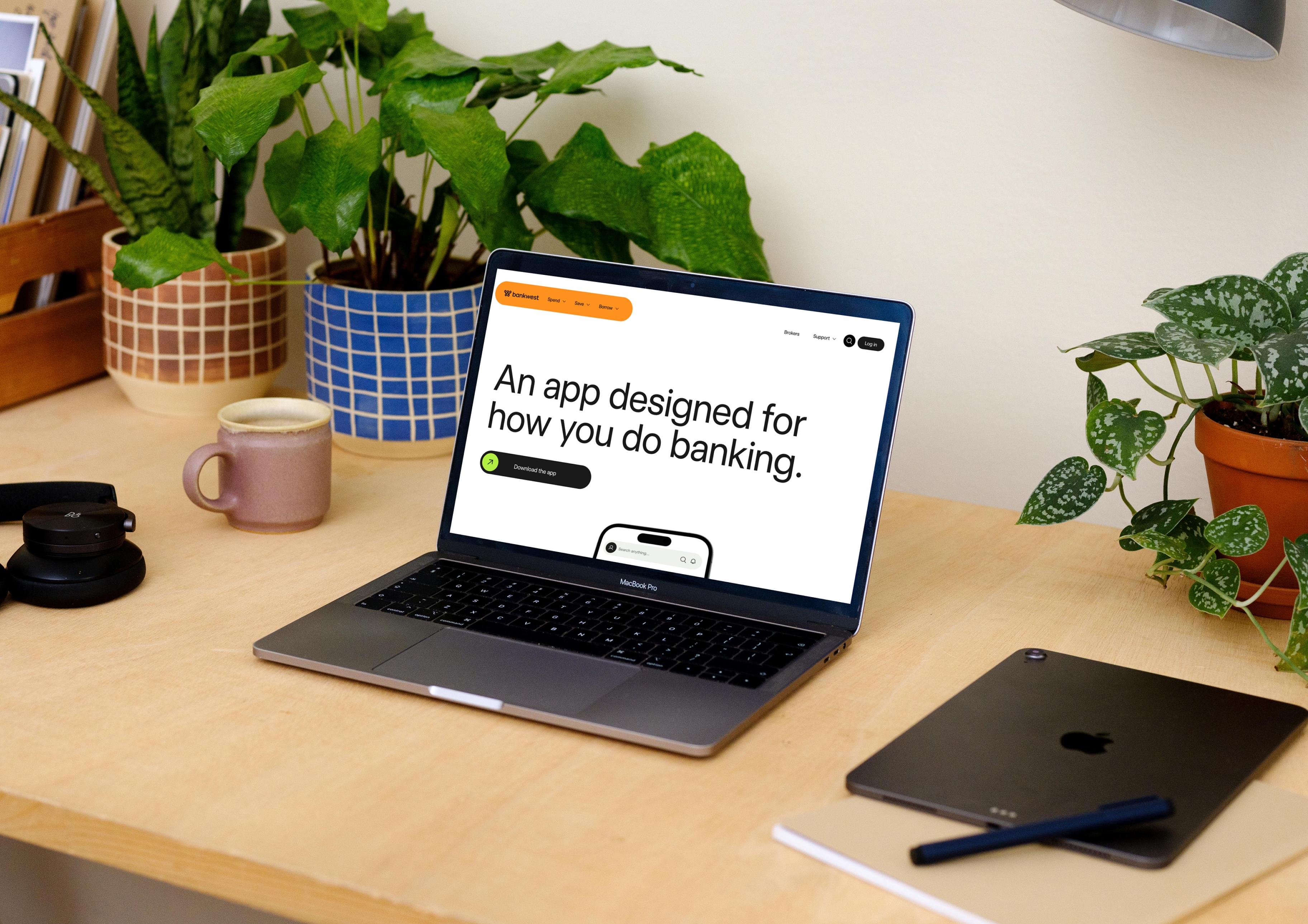
A new bankwest.com.au, and the first digital execution of the Bankwest brand.
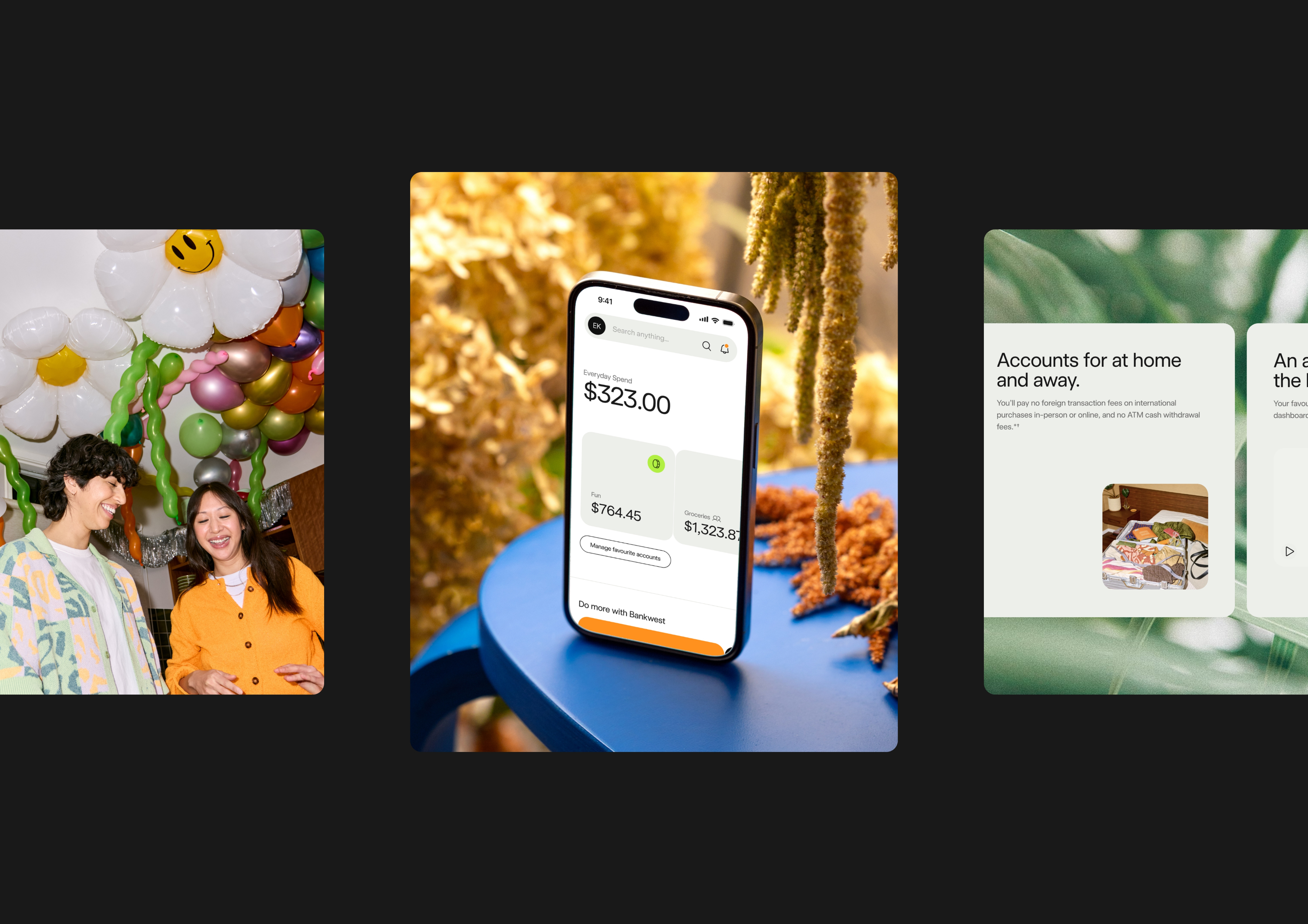
The site is organised around how customers think rather than how the bank is structured: four core needs, Spend, Save, Borrow and Support, replacing a product-led hierarchy. Products and their explanations were simplified so people can actually tell what they’re choosing between. Comparison tools let customers weigh options side by side, and personalised calculators surface the numbers that matter to their situation rather than generic ones.
Nine months, 34 research sessions, and a site built for digital natives — animations and interactions that bring it to life without sacrificing speed or security.